Tensorboard is a very useful tool for visualizing the logs of Tensorflow. It is now an independent project on GitHub, here’s the link.
In the past, if we were doing small projects, we usually printed some log information on the screen or wrote them into log files. The disadvantage is that if there are so many outputs, we can easily get lost in them.
So I think Tensorboard is a very helpful tool since it can re-organize log information, and present it in a Web form.
There are several features which I think is worth to talk about:
1 Organize logs into sub-directories.
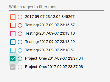
I selected a certain directory for all tensorboard logs, say it’s ~/tensorboard_logdir . And then, say, I had a project called Project_One, and I can just make a sub-directory in it. And every time I run the program, I can write log files into a sub-sub-directory which has a name of current time.
When I run tensorboard --logdir=~/tensorboard_logdir, I get this:

2 The Histogram.
We usually use histograms in bar style. The Tensorboard doesn’t.
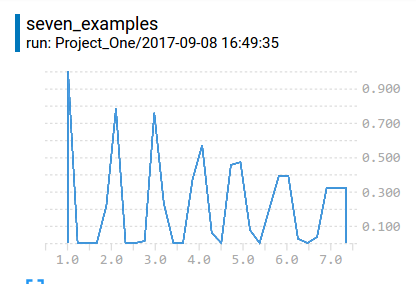
According to dandelionmane, the developer of tensorboard, the y-axis of the histogram is Density, but I think it is Frequency. For example, I created an array with 7 items–[1,2,3,4,5,6,7], and I wrote them to a histogram, I’d got this interesting result:

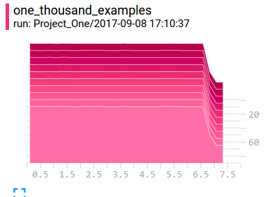
I added all values of those points, and I’d got 7. There is an interesting phenomena on the right, the item [7] was reperesented by three points which are all roughly 0.3, add up to 1. So, I think if there are not so many examples, the histogram will have problems of reperesenting. But if there are enough examples, the histogram will look smooth and nice:

3 Flush if using Ipython (Jupyter) Notebook.
Suppose we wrote some log files in Notebook. Because the program was not ended, the files might have not been writen. I have found only part of information when I run some program in Notebook because of this. So every time, please call tf.summary.FileWriter.flush or close to make sure the information is fully outputed.
4 In histogram, z-axis denotes iterations
Through z-axis, we can observe the change over time. I wrote a small piece of code:
import tensorflow as tf # version: r1.3

W1 = tf.Variable(tf.random_uniform([10000]))
W2 = tf.Variable(tf.random_normal([10000], stddev=0.13))

w1_hist = tf.summary.histogram("from_uniform_distribution", W1)
w2_hist = tf.summary.histogram("from_normal_distribution", W2)

loss = tf.norm(W1-W2)

train_op = tf.train.AdamOptimizer(learning_rate=0.01).minimize(loss)

summary_op = tf.summary.merge_all()

with tf.Session() as sess:
    writer = tf.summary.FileWriter('/tmp/tensorboard/', sess.graph)
    tf.global_variables_initializer().run()
    for i in range(100):
        m,_ = sess.run([summary_op, train_op])
        if i%10==0:
            writer.add_summary(m, i)
    v1, v2 = sess.run([W1, W2])
writer.close()
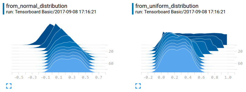
We can see those two distributions merged together during training:

In fact, after the last iteration, the data W1 and W2 are almost same, but why in histogram, those two seems different? Because the scale of y-axis is different. We can see from_normal_distribution, the initial max value is higher than the from_uniform_distribution graphic.